How thoughtful on-screen design turns information into energy — and viewers into participants.
In live production, graphics are more than design elements — they’re the bridge between your story and your audience. They help viewers connect, understand, and feel what’s happening on screen in ways that the scene alone can’t always provide.
The players, the hosts, and the story drive the content. Graphics make sure the audience stays with them every step of the way. They inform, orient, and build anticipation — transforming viewers into participants.
A scoreboard can build suspense before a play. A lower third can introduce an analyst and build trust. A short animation or stinger can reignite attention and signal the next moment. And when live comments appear on screen, viewers instantly feel included — part of a shared experience.
What many don’t realize is how much of that connection can be created through graphics alone. They’re one of the fastest, most effective ways to keep your audience engaged and returning for more.
Let’s look at how to use them with intention — to inform, involve, and elevate every moment of your production.
Start with intentional setup
Before you go live, organize your graphics like you would a script. Think about what your audience needs to see, when they need to see it, and why. A clear visual flow — introductions, transitions, scoreboards, and updates — creates a smoother and more professional show.
With template systems like the Nexus collection, grouping and triggering multiple graphics becomes second nature. But regardless of the platform, the principle is the same: plan your visuals for seamless storytelling.
Use multiple graphics to create momentum
Attention fades when visuals stay static for too long. Rotate between lower thirds, stat boxes, and live updates to keep your show dynamic and engaging. Each change adds rhythm and freshness — a visual cue that something new is happening.
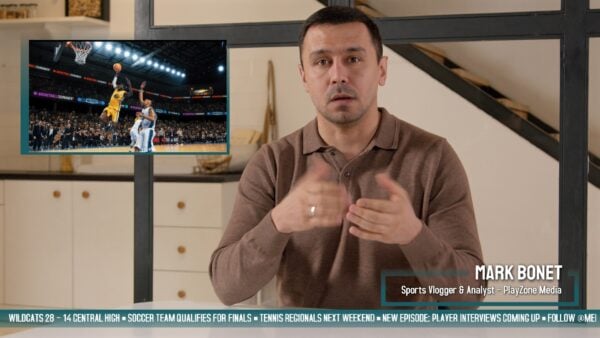
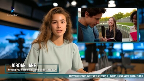
Deliver relevant, useful information
Engagement starts with clarity. Use graphics to help viewers know who’s speaking, what’s happening, and what’s next. Display names, stats, and real-time updates that make them feel guided and connected to the story.
Add style, not distraction
The best motion design enhances, not overwhelms. Clean animation, consistent color, and balanced placement keep your visuals lively but focused. The Nexus templates exemplify this — motion that feels modern and energetic while keeping the message clear.
Weave branding naturally
Branding doesn’t need to dominate to be effective. Use color, typography, and motion consistently to build recognition and trust. Subtle repetition over time creates a strong visual identity without ever feeling promotional.
![]()
Keep the scene dynamic
In live production, variety sustains energy. Alternate layouts, shift compositions, and mix full-screen visuals with overlays to keep pacing fresh. Even small visual changes can help maintain excitement and momentum.
![]()
Combine graphics and visuals to tell a story
Every production has a narrative arc — and graphics help shape it. Use them to emphasize data, spotlight achievements, or mark key emotional moments. A name reveal, a score update, or a stat comparison can all add power and meaning when used with intention.
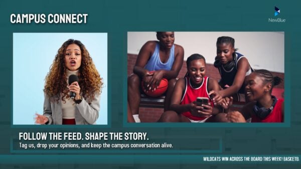
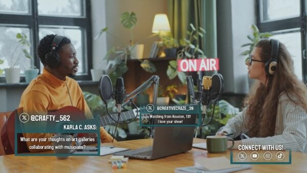
Bring the audience into the conversation
Participation builds loyalty. Display live comments, polls, or viewer messages on screen to let your audience see themselves in the show. Those small interactive moments turn passive viewers into engaged community members.
Design for connection
At their best, live graphics are about empathy. They help the audience follow, understand, and feel. When crafted intentionally, they transform viewers into participants and broadcasts into shared experiences.
Whether you’re using the Nexus Suite or your own templates, the principle is the same:
thoughtful graphics make your story more human, more dynamic, and more alive.
Explore the Nexus Suite for more ways to maximize your graphics.