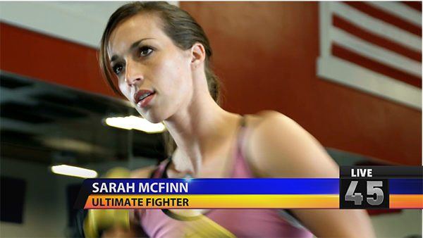
Lower thirds are indispensable in broadcast, documentary and reality TV. Free lower third templates found on the Internet can range from poor to excellent but when you need something new there’s nothing like creating your own.
With a little inspiration and Titler Pro 4 in hand, we’ve created a tutorial to help you make your own lower thirds for broadcast purposes, whether it be on your emerging Youtube web show or news broadcast.
Grab your best thinking fedora and get ready to create.
Let’s get started on your very own, broadcast lower third…
The first thing is finding the right inspiration. For this tutorial, a nice classic news-style lower third color palate is ideal. This time we’re going with a classic Blue and Yellow.
Step 1: Get rid of the “Enter Text” paragraph and add a new rectangle shape. Stretch it out to your desired length and head over to the Object Tab.
In the Object Tab, move the Skew slider to 38 to give your rectangle a slope. Head over to the Style tab and give the rectangle a 3-color gradient. For this example, we will choose black/blue/black and turn the gradient handles horizontally.
Set the Extrusion slider to 10.9, set the bevel size to .09 and Shininess to 86.4
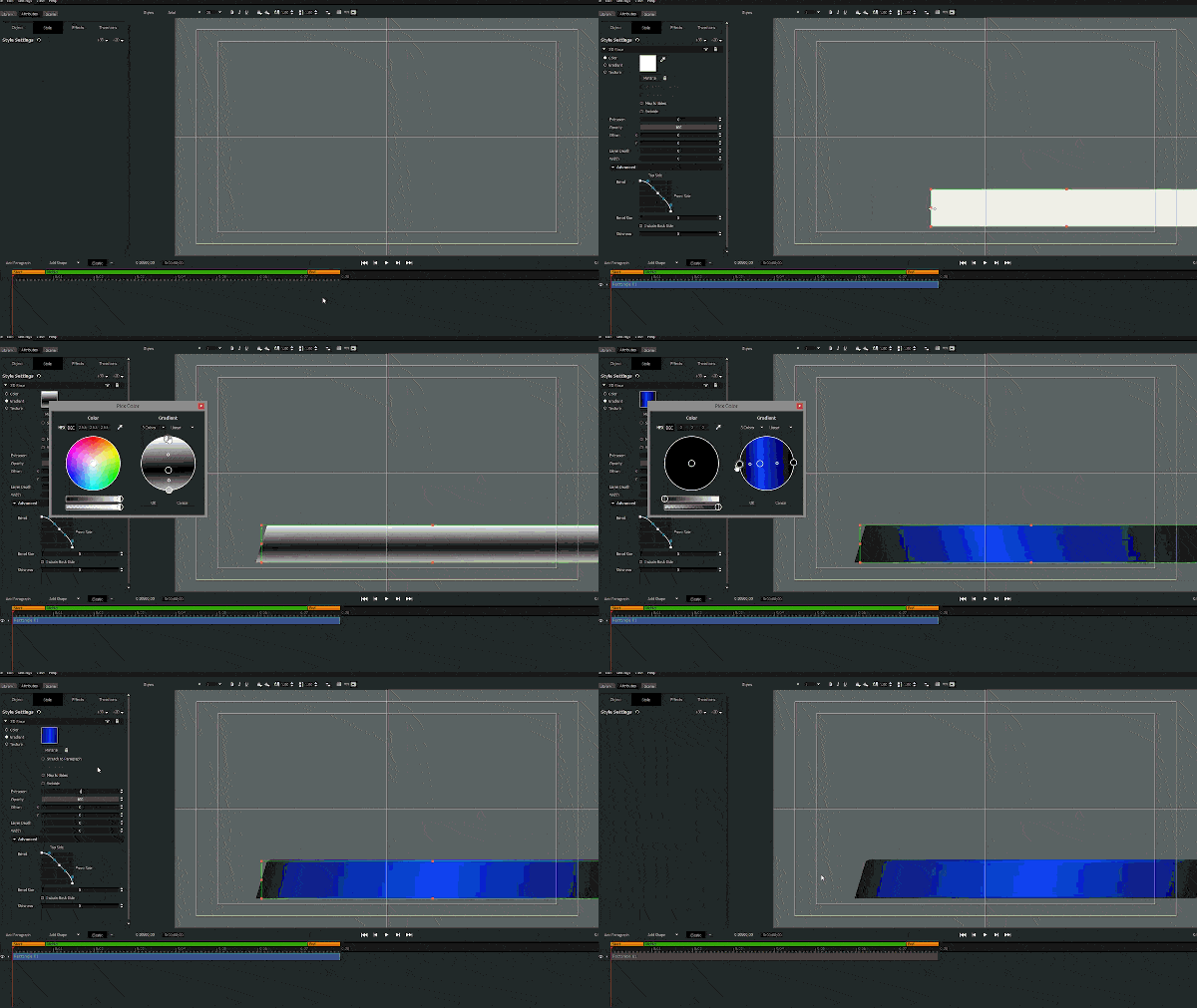
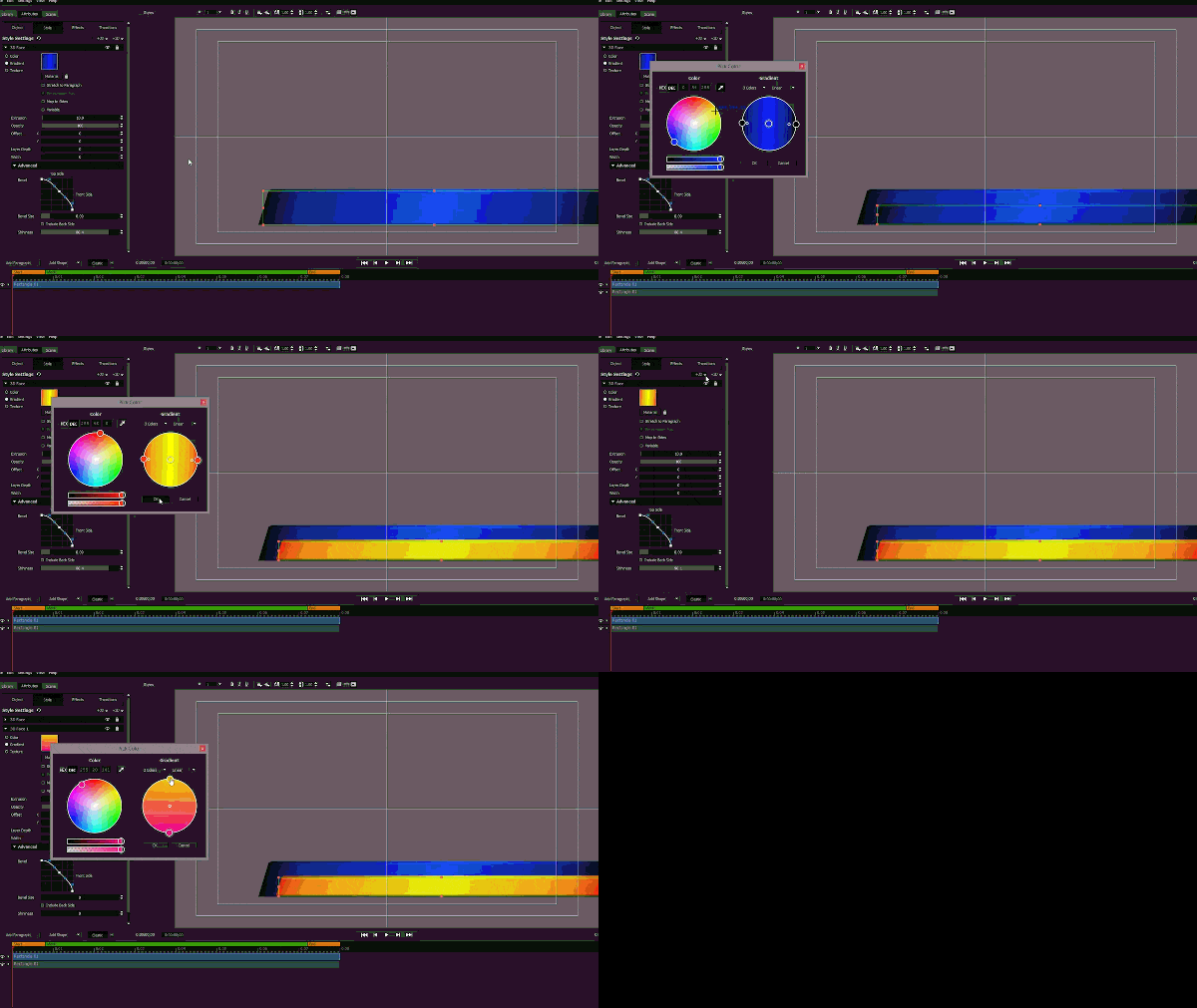
Step 2: Duplicate the blue rectangle paragraph by holding Ctrl (or Command) key and dragging it. In the Style tab, change the gradient’s color to Red-Orange/Yellow/Red-Orange.
Add another 3D Face by clicking on the “3D” button at the top of the Style tab and selecting “Face” from the drop-down list.
Add a gradient then color the upper half yellow and the bottom half pink. Change the Layer depth to 1 and set the Opacity slider to 8.
These gradients will give your title a bit more of definition.
Step 3: Now it’s time to add the number box. Add a new rectangle shape and align it to the left side of the title as shown below.

Change the rectangle’s color to black. Add a Gloss Face. Add another 3D face and color it black, but this time set this face to -100 width. Make sure the layer depth is set to 1.
This will create an “outline” with a gloss face around your rectangle.
Step 4: It’s time to add another element to the title. A simple, but stylish bar to house your number box.
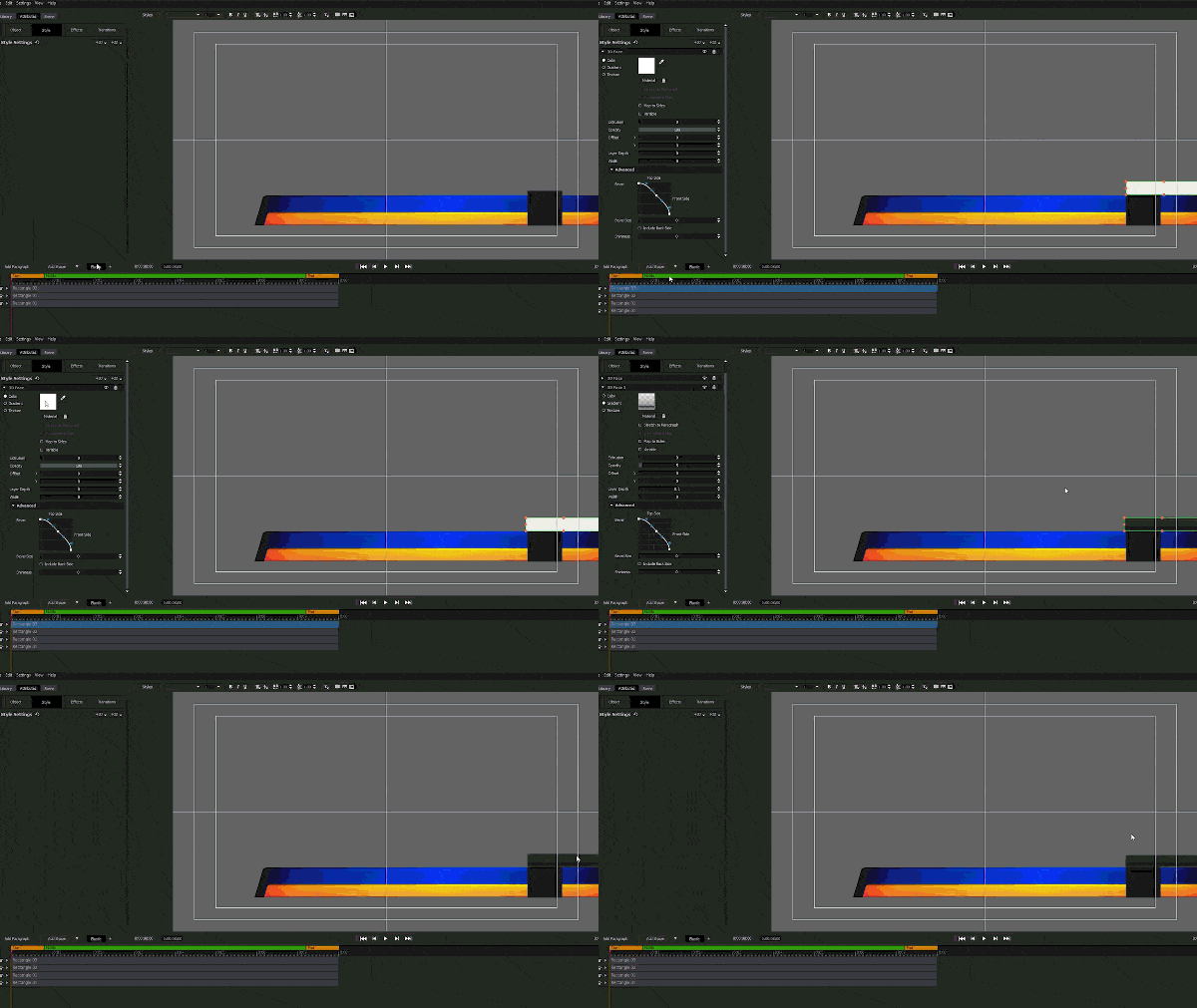
Add a new rectangle shape, change its color to black and add a gloss face. Adjust it to fit right above the box created in Step 3.
Tip: Be sure to label your paragraphs in your timeline to avoid confusion. Rename a paragraph by double- clicking on the paragraph’s name in the timeline.
Step 5: It’s time to bring in some text. Add a new paragraph and type in your subject’s name. For this tutorial, we will go with the font Myriad Pro in the Bold style.
After the name has been entered, duplicate the paragraph and enter your subtitle.
This is a good opportunity to pick the colors of your title and subtitle.
Resize and position your text as you see fit.
Step 6: Remember that number box we made earlier? Well, it’s finally time to add the number!
Add a new paragraph and type in your favorite number. For this example, we are going with the number 45. Now let’s change the font to Dinova.
Add a 3-color gradient in gray/white/gray and adjust the gradient handles by bringing them closest to the center. Add another Gloss Face style layer and do the same with the Gloss Face gradient handles to get your desired effect.
Give the number some extrusion and adjust it to fit inside the number box.
Step 7: Let’s add some text to the black bar we created earlier. Duplicate one of your text paragraphs and change the text to say “Live”. Apply a subtle 3-color gradient to the text and reposition it on the black bar above your number box.
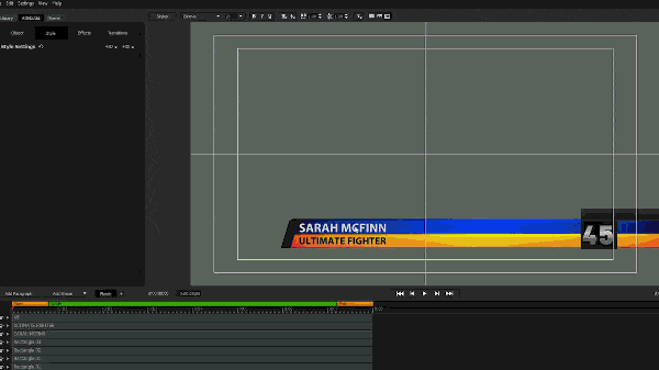
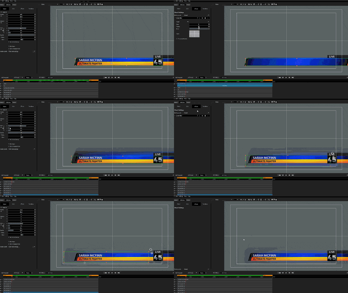
Step 8: Duplicate the blue rectangle paragraph and apply a Zoom Blur effect from our Stylizers collection in the library.
Modify the Zoom, Position and Blend sliders and adjust the zoom center to get your desired blur.
Go back to the Style tab and lower the opacity. The goal of this is to add a bit of substance to your title.
Move the paragraph to the track below all the other paragraphs to place it behind all the others.
I know, a lot of steps. Don’t worry we’re almost finished.
Step 9: OK, now it’s time to add a little flair to our title. Import a flare or glint texture from your computer. For this example, we will use this one.
Resize it and place it at the corner of the yellow rectangle layer. Then change the blend mode by going to the Effects tab to adjust the flare to your liking or apply Video Tuneup Plus from our Essentials collection.
Time to animate the flare.
We can give the illusion of growth by keyframing the flare in 3D space.
Head over to the Object tab and place your playhead at the beginning of the timeline. Check the “Enable Keyframing” box and set the X rotation to -90. This will flatten the flare and make it seem invisible.
Drag the playhead to the middle of the timeline and place the second keyframe, then set the X rotation back to 0 and change the position of the flare to the middle of the title.
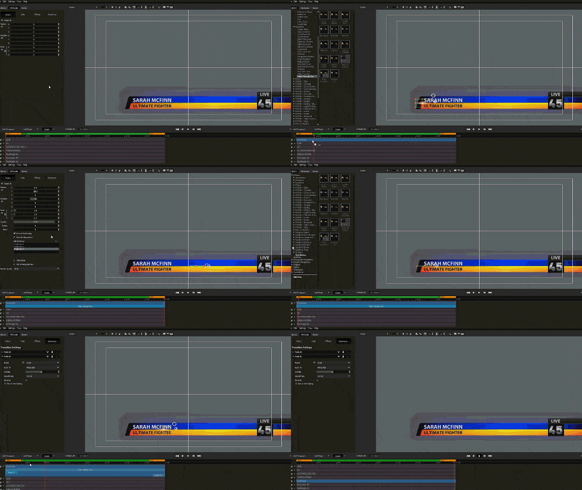
Place the playhead at the end of the timeline and add the third keyframe. Set the flare’s X rotation back to 0 and the position to where you want the flare’s animation to end.
Do the same for the blue rectangle layer. Don’t be afraid to get creative.
If you’re feeling adventurous, you can try using the Timed Pan animation found only in Titler Pro 7 to animate your flares.
Step 10: Import your footage and adjust your title to make it look the way you want.
Adjust the blur, adjust the timing and finesse the colors. Check the timing of your flares and fix any inconsistencies.
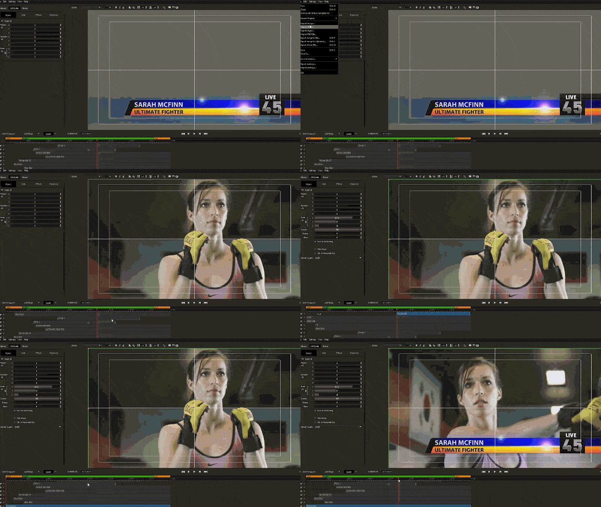
There you go, now you should have a nice broadcast-ready looking title.
Extra, Extra, Read all about it!
Now that you have your title laid out, feel free to polish it up with transitions, animations, and effects.
Adjust the timing of each individual layers, apply transitions and spend some time compositing your title.
For information on importing packages, see: Importing and Exporting Packages
Want to See More?
See more of what Titler Pro 7 can do at https://newbluefx.com/titler-pro/
