In the fast-paced world of live news, information comes at viewers from every angle—breaking headlines, live locations, weather updates, interviews, social feeds, and more. To communicate all of this effectively, graphics play a starring role. But here’s the challenge: when too many visual elements fight for attention, the result can feel chaotic and overwhelming.
The solution? Alignment and visual cohesion.
When Graphics Work Against You
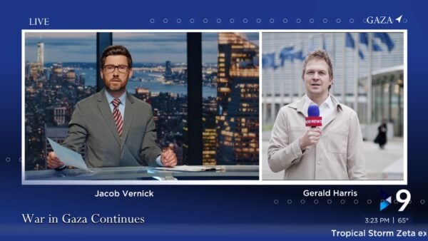
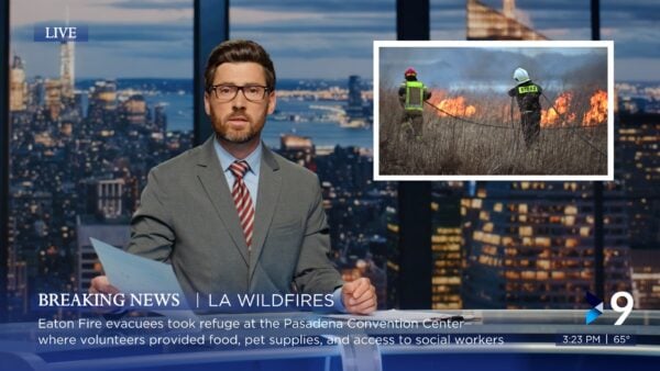
Think about a typical news screen. At any given moment, you might see:
- Lower thirds with breaking news text
- Crawls updating live headlines
- A station bug in the corner
- Time and weather indicators
- A “LIVE” tag and on-location info
- Picture-in-picture interviews
- Side lists with story rundowns, stock information, or weather snapshots
Alone, each graphic has value. Together—if poorly aligned—they can create visual noise, distracting viewers instead of informing them.
The Eye Loves Harmony

When graphics are well-aligned, balanced, and thoughtfully layered, they do more than deliver information—they guide the viewer’s eye naturally and effortlessly. Proper alignment creates a sense of structure, hierarchy, and polish. It’s the difference between a screen that feels cluttered and one that feels clean, professional, and engaging.
Good design ensures that each element supports the others. Crawls don’t compete with lower thirds. Station bugs feel anchored, not floating. Picture-in-picture frames don’t overlap essential information. And side lists—whether they’re showcasing key story points, the latest market updates, or regional weather—sit neatly in place, adding context without stealing focus.
It’s this subtle orchestration that keeps viewers focused on the story, not the chaos.
Why It Matters in News (and Sports)

News broadcasts are inherently information-heavy. Viewers tune in to get the facts fast, and they expect clarity. Misaligned or mismatched graphics don’t just look unprofessional—they can actually erode trust.
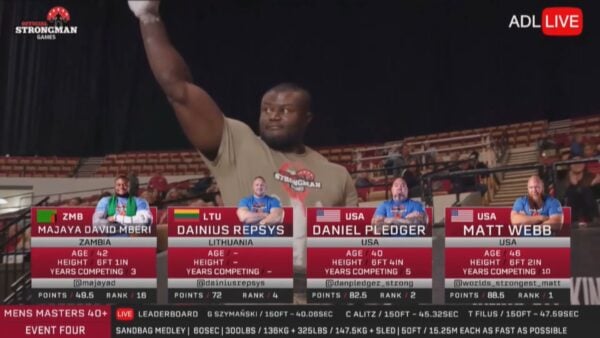
And the same holds true for sports. Live sports productions are packed with even more on-screen elements—scores, stats, replays, sponsor bugs, and player highlights—all layered in real-time. When those visuals work cohesively, they enhance the excitement instead of distracting from it.
Case in Point: ADL Productions

ADL Productions—well-known for their live sports broadcasts—embraced this philosophy. By refining their on-air graphic alignment and embracing a cohesive visual style, they elevated the viewer experience. Their sports coverage now feels polished, seamless, and highly professional—so much so that they’re in higher demand than ever before.
Enter the Veritas News Collection
We designed the Veritas News Collection with this exact principle in mind. Whether you’re running a breaking news segment or a fast-paced sports broadcast, every element—lower thirds, crawls, side lists with market or weather updates, and picture-in-picture frames—has been crafted to blend beautifully on-screen.
Instead of fighting for attention, every graphic works as part of a larger visual ecosystem. Your message comes through loud and clear, while your show looks cleaner, sharper, and more professional than ever.
The Bottom Line
In live production, clarity is everything. And clarity starts with design. Cohesive alignment turns a chaotic broadcast into a compelling viewing experience—one that keeps audiences informed, engaged, and coming back for more.

With Veritas News Collection, we’re here to help you achieve exactly that. Because the better we make you look, the better your show will be—and the more your audience will trust you.
